Introduction to CSS
https://frontendmasters.com/bootcamp/introduction-css/the-cascade/ https://frontendmasters.github.io/bootcamp/css#common-css-properties-and-values
Get started
- Create an .html file, specifying in the
<head>:<link href="CSS/style.css" rel="stylesheet"> - Create the
style.cssfile and specify the style of various parts of the html document. - To show both windows (html + css) next to each other in Visual Studio Code, right click on one of the files in the Explorer section and select Open to the side.
To run the website in your browser (from Visual Studio Code), click Terminal > New terminal and then type live-server into the terminal. Then the webpage will show up in the browser and changes will be updated (when saved in VS).
To refer to specific parts of the document, just type the part, followed by curly brackets, e.g.
body { font-size: 3rem;
background: green;
`
You can refer to img (e.g. specifying borders around images), h1 (to change the style of all H1 headers), a (to change the style of all links), etc.
If there are several segments with the same style, you can group them together, e.g.
h2, h3 {....}
Classes
To further specify a style for certain selected parts of the website, create a class in the stylesheet:
.someclass { (some css style)}
and then in the .html file, add the following tag to the part of the code you want to apply that style on, e.g. a certain paragraph only.
<p class="someclass"> ...... </p>
Classes can be used several times in a document. You can use more than one class per html tag.
Pseudo-classes and links
Pseudo classes often start with a colon.
a:link ⇒ unvisited links of a webpage
a:visited⇒ style for visited links
a:focus ⇒ the currently “focused” (selected) element
a:hover ⇒ state of link when hovered over
These pseudo classes (if used) must go in the order listed! L - V - F - H
It’s very nice, for example, to change the background colour of the link or make the text go bold when hovered over.
To use classes for specific links (e.g. a class “bigandbold”, in the stylsheet write:
a.bigandbold { .... } and in the .html file write add the class tag to the relevant: …`
NB: Here, it’s just a . whereas in the pseudo classes referring to all links in general, it was a :
Classes and pseudoclasses can also be grouped together (with other segments) if they should have the same style, e.g.:
h2, h3, .bigandbold, a:link { .... }
NB: separated by comma!
So the style is applied to all of these elements!
Targeting things more specifically
Chain the “location” together with spaces in between. = descendant selector.
E.g. all unvisited links located inside an unordered list:
ul a:link { .....}
NB: separated by space!
So the styling is only applied to the a:link of the unsorted list.
IDs
Simliar to classes, but can be used only once per page.
IDs start with #:
#smallanditalics { .... }
IDs are very specific, overriding styles from elements and classes. IDs are not very common in CSS nowadays, but very common in Javascript.
Using a different font than what is by default offered in css
Find a font on Google Font, e.g. Crimson Text. https://fonts.google.com/specimen/Crimson+Text
Click on the little + sign next to the example text, e.g. for Regular.
In the “Use on the web” box, select “@import”, then copy the text in between the <style>... </style> tags.
Paste this text at the very top of your css stylesheet.
Then, when selecting a font-family, select “Crimson Text”.
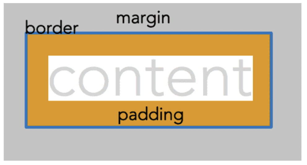
The Box model
< div>
Makes a box. (div = division)
It’s often very useful to draw borders around elements (divs, paragraphs, headings, etc.) to figure out if the distance between them is caused by padding or by margins.
p { border: 2px black solid; }
margin
Margin values can be negative or positive. Negative margins makes divs overlap.
margin-top, margin-bottom, margin-right, margin-left
border
Border around the div.
border-width, border-style, border-color, border-top, border-top-width, border-top-style, border-top-color, etc.
Example of how to use divs
<div class = "box1"><p>Some text, blalbabllablab </p></div>
And then in the css style sheet, the style of the .box1 class can be specified, e.g.:
.box1 {width: 25%;
border: 2px solid black;
background-color: green;
}
block vs. inline elements
Block elements stretch across whole screen. Inline elements are only as wide as their content (e.g. images, links, strong text, emphasised text).
In inline elements, you can only add padding to either side, not on top and bottom!
How to change an inline element to a block element
When I have a link (in-line element) and I want it to be bigger, e.g. filling out a whole box that is clickable.
a {display: block;}
Navigation bars
User <nav> html tag and fill it with an unordered list (<ul>) of links. To access only the links in that nav bar in the css style sheet (to e.g. specify a hover state), use :
nav a:hover {....}
Example of creating a navigational bar with clickable buttons
- In .html, make an unordered list (
<ul><li><a....>) inside a<nav>tag with the links that you want in the navigation bar. - In .css, change the font, e.g.
body {font-family: Arial, Helvetica, sans-serif;} - To access the list of navigation bar elements, type inside of
nav ul {...}. - To remove the points in front of unordered list items:
list-style-type: None - Good idea to clean up (i.e. remove) unnecessary margins and padding from some elements:
nav ul {padding: 0; margin: 0;} - Reduce the width of the box containing the links, i.e. the
<li>element:nav li {width: 8rem;} - Give the box a background colour to make it more visible:
nav li {background-color: lightblue;} - Center the link text inside the box:
nav li {text-align: center;} - Remove underlines of links:
nav a {text-decoration: none;} - More space between the buttons:
nav li {margin-bottom: 0.5rem;} - Change the hover state of the link:
nav a:hover {background-color: blue; color: lightblue;} - To make the link clickable area as big as the box that contains it, the link has to be changed from an inline element to a block element:
nav a {display: block;} - To make the vertical list of link buttons into a horizontal list:
nav li {display: inline-block;}
Floats
Useful when text should flow around an image nicely.
Make a class that you apply to the picture that defines that the image should be on the left and text should float around it:
.floatleft {float: left;}
Shorthand for margins/padding
Instead of specifying margin-left, margin-top, etc. use the TRBL shorthand:
margin: 2rem 1% 2px 0;
Can have mixed units.